Aspects Dashboards User Guide
Aspects Dashboards allows customers to view, interact with, and share healthcare data analytics that explore the costs, risks, and liabilities of their populations. It empowers users to make decisions that improve health outcomes and achieve cost savings.
The Aspects Dashboards application has four available collections of related analytics, further subdivided into pages and tiles. Disclaimer: The exact collections, pages, and tiles displayed may vary based on your configuration, customizations, or integrations. Please contact your Client Manager for any questions about available content.
Total Cost of Care Collection: The tiles in this collection display key utilization metrics to show users which service categories have the highest rates of usage and spend.
Available pages in the Total Cost of Care Collection:
Enrollment & Demographics Collection: The tiles in this collection illustrate member demographics as well as trends related to various member and contract types.
Available pages in the Enrollment & Demographics Collection:
Financial Insights Collection: The tiles in this collection help users identify trends in spend for a population and understand drivers of their financial performance.
Available pages in the Financial Insights Collection:
Opportunity Collection: The tiles in this collection provide actionable insights for improving financial performance & member outcomes by examining the clinical conditions and disease states driving a population's risk.
Available pages in the Opportunity Collection:
Performance Collection: The tiles in this collection allow users to understand how efforts around improving membership compliance have affected financial outcomes.
Available pages in the Performance Collection:
Overview
This User Guide discusses the contents and functionality of Aspects Dashboards and its collections, pages, and tiles.
Section 3 defines key terms used throughout the document.
Section 4 provides instructions for accessing and navigating the application, such as how to interact with pages using the Global Filters.
The remaining sections are an outline of the metrics included within Aspects Dashboards, organized by collection and page.
Disclaimer: The metrics, filters, and other content described in this User Guide may vary based on your specific configuration, customizations, or integrations.
Key Terms
| Term | Definition |
|---|---|
| Reporting Period | A reference point in time for which values are computed, including costs, counts and model results. This will always be the 1st of any given month and is based on the date claims are incurred. The data presented within the application is based on 12 months prior to this date. Any predictive metrics are predictions for the 12 months following this date. |
| Selected Period | The time period for which users would like to see metrics. |
| As-of-Month | The most recent complete month available based on the data received with a three-month lag. For example, if real time is April 1, 2020, then the most recent model run has a reporting period of January 1, 2020. This means that the latest month with a complete set of data is December 2019. Therefore, the As-of-Month is December 2019. |
| Peers | Peer groups can be used to make meaningful comparisons of clinical utilization, financial cost, and population health risk. Users define comparison peer groups from the book of business data through combinations of the Global Filters. |
| Me | The user who is accessing the application. |
| Global Filter | A filter that affects every tile on a page. For example, the Relationship Type filter on the Inpatient page in the Total Cost of Care collection. |
| Local Filter | A filter that affects only a specific tile, such as the Total Opportunity filter on the Disease Onset Opportunities tile on the Disease Onset page under the Opportunity collection. |
| Cross Tile Filter | A filter that affects two or more tiles on a page. Cross tile filters are seen on many pages, such as the Care Pathway filter on the Member Redirection page available in the Opportunity collection. |
| Collection | A collection contains a set of related pages. Available collections include: Total Cost of Care, Enrollment & Demographics, Opportunity, and Performance. |
| Page | A view within a collection that contains tiles. For instance, Inpatient is a page within the Total Cost of Care collection. |
| Tile | A specific chart or visualization in a collection. For example, the Total Spend visualization on the Inpatient page is a tile. |
| Clinical Quality Measure (aka "Clinical Measure") | The deviation of patient experience from evidence-based best practices. For example, it is recommended that all diabetics ages 18 to 75 receive an annual retinopathy screening. If a confirmed diabetic fails to receive this screening in a given year, he or she is said to have an open clinical measure. Closing this measure can yield savings because failure to intervene early increases the likelihood of expensive and debilitating complications associated with retinopathy, including vision loss. |
| cScore Predict (aka "cScore") | A prospective model to predict future financial risk at the member level. Used when assessing future costs, risks, and liabilities. Also referred to as "cScore" in other areas of the User Guide. |
Getting Started
Requirements
Aspects Dashboards is developed and tested using supported versions of modern web browsers, to include Google Chrome, Microsoft Edge, and Mozilla Firefox.
NOTE: Screen resolutions between 720p and 1080p are preferred. Resolutions below 720p are not supported.
Update Password
On first login to the application, users are required to update their password.
NOTE: This does not apply to customers with a Single Sign On (SSO) integration.
Forgot Password
Users can reset their password by clicking on the "Forgot Password?" link above the "Login" button.
Users will then receive an e-mail from support@certilytics.com with a message indicating that someone has just requested to change your account's credentials. The e-mail will provide a link to reset the user's credentials. This link is valid for 5 minutes.
- If you did not request a new password, simply ignore the request.
NOTE: This does not apply to customers with a Single Sign On (SSO) integration.
Session Timeouts
Session Idle
This is the time a session is allowed to be idle before it expires. Tokens and browser sessions are invalidated when a session is expired.
If the user is not active for longer than this timeout, the user session will be invalidated. A client requesting authentication will reset the idle timeout. Refresh token requests will also reset the idle timeout.
Session Max
This is the maximum time before a session is expired. Tokens and browser sessions are invalidated when a session is expired.
This is a hard number and time. It controls the maximum time a user session can remain active, regardless of activity.
The timeout is set at two hours but can be customized.
Troubleshooting
For help with the Aspects Dashboards, users should email the following address: support@certilytics.com
Basic Dashboard Usage
Navigating the Aspects Dashboards App
After logging into Aspects, users can navigate using tabs at the top of the page.
These tabs represent the available collections within the Aspects Dashboards app. Below that are a series of tabs listing the pages within a collection. Users can navigate from one collection or page to another by clicking on the various tabs.
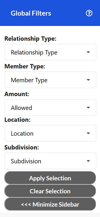
Global Filters
Global Filters are the primary tool for manipulating the visualizations in the app. Global Filters affect all visualizations in a collection. They are used to subset the population to desired groups. Apply any combination of filters to the population, and the graphs modify to reflect the chosen sub-population.
Some combinations of Global Filters may not apply to a given tile, in which case the tile will not present any data. For instance, a specific measure within the "Clinical Measure Details" tile may not apply to a specific sub-population. In this case, the tile would state, "The selections generated no data for this chart."
By default, the filters are unselected. To apply a Global Filter, simply make your selection(s) in the sidebar menu and hit 'Apply Selection'. In order to remove a single selection, click the 'X' button beside that value and then click 'Apply Selection' to refresh your data. To remove all filters and set your data back to the default values, click 'Clear Selection'.
The potential variables affected by Global Filters are below. The actual variables shown in a given view of Aspects Dashboards may vary:
| Variable | Definition |
|---|---|
| Reporting Period | A reference point in time for which values are computed, including costs, counts and model results. This will always be the 1st of any given month and is based on the date claims are incurred. The data presented within the dashboards are based on 12 months prior to this date. Any predictive metrics are predictions for the 12 months following this date. |
| Member Type | The coverage or employment status of members. Examples include Active, Retired, COBRA, etc. |
| Subdivision | A division within the user population. When Peer groups are displayed, the Subdivision value is specific to the user and does not affect the Peer group. |
| Location | By default, the metropolitan statistical area (MSA) members live in. The level of granularity shown for a specific configuration may vary. |
| Relationship | It denotes the member's relationship to the subscriber of the plan. Examples include Self, Spouse, Child, etc. |
| Amount | The amount type used to calculate metrics such as Spend PMPM. Allowed and Paid options are available depending on a user's specific configuration, customizations, or integrations. |
Info Icon
The tiles within the collections include “info” icons that explain the visualization. These info icons provide key information, such as an explanation of the axes in a chart or descriptions of the variables displayed.

To see the information within this icon, simply hover the cursor over it.
Options Icon
Some tiles within the collections have an “options” icon (ellipsis) that allows further options for the specific tile.

Hover the cursor over a tile's options icon, and the following options are available:
-
Print
-
Screen shot
-
Download chart data (provided as a .csv file)
-
Expand to full screen
-
Info icon
Calendar Icon
Some pages have a calendar icon that states the As-of-Month for the metrics on that page. This is the most recent month available based on the data received with a three-month lag.
Hover the cursor over the icon to determine the As-of-Month for a specific page.

Understanding the Collections: Total Cost of Care
Inpatient
This page displays key utilization metrics and trends related to the Inpatient service category.
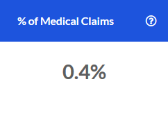
% of Medical Claims
The percentage of medical claims over the most recent 12 months that fell into the Inpatient service category.
# of Admissions
The count of inpatient hospital admissions over the most recent 12 months.

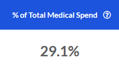
% of Total Medical Spend
The portion of total medical spend for the most recent 12 months that is attributable to the Inpatient service category.
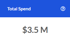
Total Spend
The total spend in the Inpatient service category over the most recent 12 months.
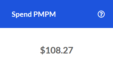
Spend PMPM
The PMPM spend in the Inpatient service category for the most recent 12 months.
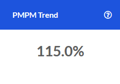
PMPM Trend
The change in PMPM Spend for the Inpatient service category compared to the same time one year prior.
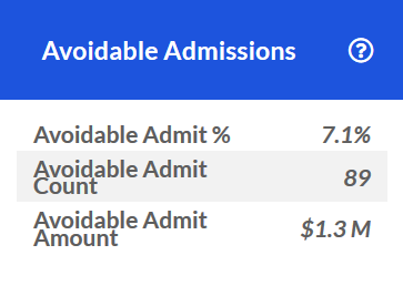
Avoidable Admissions
Key utilization and spend metrics related to avoidable Inpatient admissions over the last 12 months.
For example, an Avoidable Admit % of 7.1% means that for all Inpatient admissions over the last 12 months, 7.1% of them were avoidable. As shown in the screenshot below, this equates to 89 visits and an avoidable spend of \$1.3M associated with them.
If there were no avoidable Inpatient admissions during this time frame, the tile will display "0" for each value.
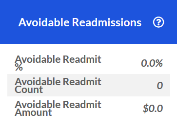
Avoidable Readmissions
Key utilization and spend metrics for avoidable Inpatient readmissions during the last 12 months.
For example, an Avoidable Readmit % of 0.7% means that for all Inpatient readmissions over the last 12 months, 0.7% of them were avoidable. As shown in the screenshot below, this equates to 4 visits and an avoidable spend of \$57.5K associated with them.
If there were no avoidable Inpatient re-admissions during this time frame, the tile will display "0" for each value.
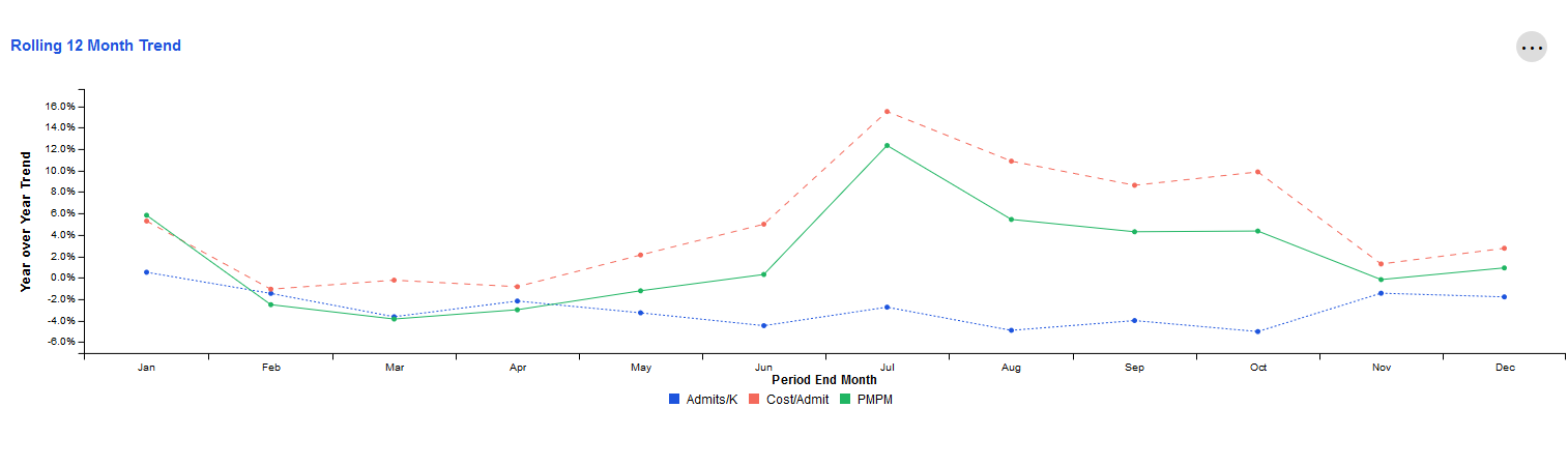
Rolling 12 Month Trend
This tile examines trends for key metrics related to the Inpatient category. Each data point represents the end of a 12 month period as compared to the preceding 12 month period. The resulting values indicate whether the overall trajectory of the trend is increasing or decreasing.
The X-axis represents the month that marks the end of this 12-month period. The Y-axis represents the change for that 12-month period compared to the same 12-month period one year prior.
For example, the screenshot below shows -5.0% for Admits/K in October. Let's assume the year is 2020. This would mean that during the time period November 2019-October 2020, Admits/K decreased by 5.0% when compared to November 2018-October 2019.
To view more detail about a specific time period's metrics, simply hover over the data points for that ending month with your cursor.
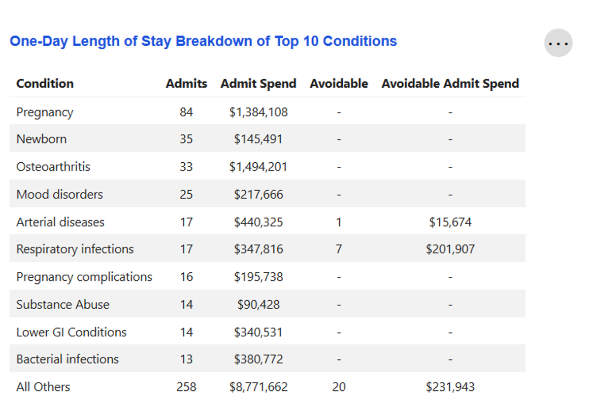
One-Day Length of Stay Breakdown of Top 10 Conditions
Key metrics on the top 10 conditions for which members had a one-day inpatient hospital stay, as determined by the number of admits.
If any of these admissions were avoidable, the number of avoidable admissions and the potential savings had that admission not occurred will be displayed. Otherwise, a "—" will be shown in the "Avoidable" and "Avoidable Admit Spend" columns.
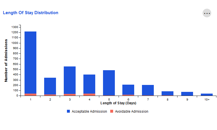
Length of Stay Distribution
The number of inpatient admissions in the last 12 months that lasted for a specific amount of time, from 1 day to 10+ days.
Admissions are also categorized as "acceptable" or "avoidable".
For example, the screenshot below displays a population where the majority of Inpatient admissions over the previous 12 months lasted for one day. Of those one-day admissions, approximately 50 were avoidable.
To view more detail about a specific category, simply hover your cursor over the bar that corresponds to that length of stay.
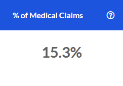
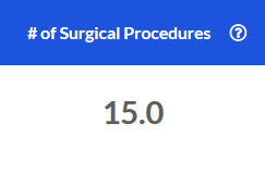
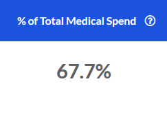
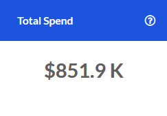
Outpatient
This page displays key utilization metrics and trends related to the Outpatient service category.
% of Medical Claims
The percentage of medical claims over the most recent 12 months that fell into the Outpatient service category.
# of Surgical Procedures
The count of outpatient surgical procedures over the most recent 12 months.
% of Total Medical Spend
The portion of total medical spend for the most recent 12 months that is attributable to the Outpatient service category.
Total Spend
The total spend in the Outpatient service category over the most recent 12 months.
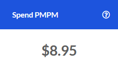
Spend PMPM
The PMPM spend in the Outpatient service category for the most recent 12 months.
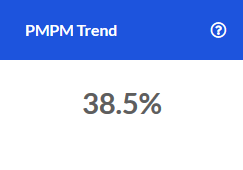
PMPM Trend
The change in PMPM Spend for the Outpatient service category compared to the same time one year prior.
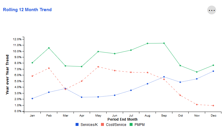
Rolling 12 Month Trend
This tile examines trends for key metrics related to the Outpatient category. Each data point represents the end of a 12 month period as compared to the preceding 12 month period. The resulting values indicate whether the overall trajectory of the trend is increasing or decreasing.
The X-axis represents the month that marks the end of this 12-month period. The Y-axis represents the change for that 12-month period compared to the same 12-month period one year prior.
For example, the screenshot below shows approximately 5.0% for Services/K in October. Let's assume the year is 2020. This would mean that during the time period November 2019-October 2020, Services/K increased by 5.0% when compared to November 2018-October 2019.
To view more detail about a specific time period's metrics, simply hover over the data points for that ending month with your cursor.
Outpatient Components
Key metrics and trends related to Outpatient service category components for the current time period only.
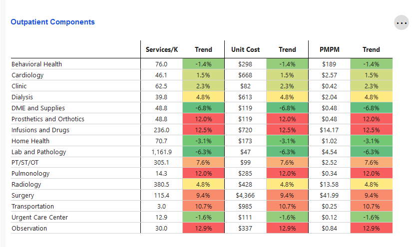
Trend values are color-coded, with the biggest decreases compared to one year prior being green and the highest increases compared to one year prior being red. Shades of green, yellow, and orange mark the remaining trend values. Trends closer to red are higher and less favorable than those closer to green.

ER
This page is designed to show key utilization metrics and trends for the Emergency Room service category. Among the metrics shown are those related to avoidable ER visits and the financial impact of such visits.
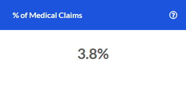
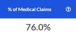
% of Medical Claims
The percentage of total medical claims over the most recent 12 months that fell into the Emergency Room service category.
# of Visits
The number of Emergency Room Visits over the most recent 12 months.

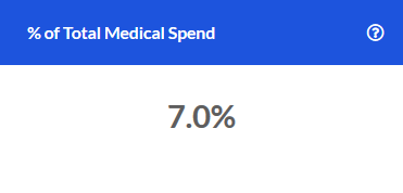
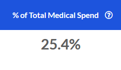
% of Total Medical Spend
The portion of total medical spend for the most recent 12 months that came from the Emergency Room service category.
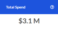
Total Spend
The total spend in the Emergency Room service category over the most recent 12 months.

Spend PMPM
The Emergency Room service category Spend PMPM for the most recent 12 months.

PMPM Trend
The change in PMPM Spend for the Emergency Room service category compared to the same time one year prior.

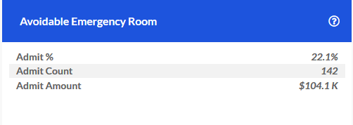
Avoidable Emergency Room
The percentage of ER visits over the last 12 months that were avoidable, as well as the number of visits and the amount spent on these avoidable visits.
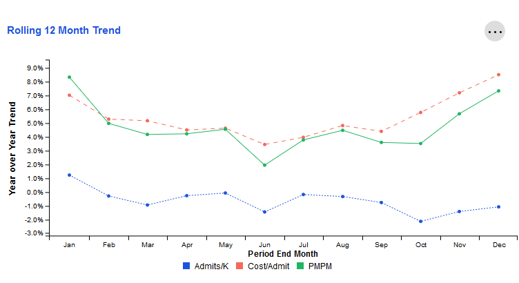
Rolling 12 Month Trend
This tile examines trends for key metrics related to the ER service category. Each data point represents the end of a 12 month period as compared to the preceding 12 month period. The resulting values indicate whether the overall trajectory of the trend is increasing or decreasing.
The X-axis represents the month that marks the end of this 12-month period. The Y-axis represents the change for that 12-month period compared to the same 12-month period one year prior.
For example, the screenshot below shows approximately -1.0% for Admits/K in June. Let's assume the year is 2020. This would mean that during the time period July 2019-June 2020, Admits/K decreased by 1.0% when compared to July 2018-June 2019.
To view more detail about a specific time period's metrics, simply hover over the data points for that ending month with your cursor.
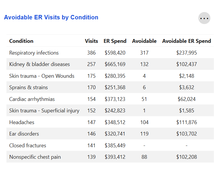
Avoidable ER Visits by Condition
Key metrics for the top 10 conditions for which members visited the Emergency Room over the last 12 months. The number of avoidable ER visits for each condition, along with the potential financial savings had those visits not occurred, are also displayed.
Some of these conditions may not have any avoidable ER visits associated with them. In this case, a "—" would be displayed. See the condition "Closed fractures" below as an example.
Professional
This page displays key utilization metrics and trends for the Professional service category.
% of Total Medical Claims
The percentage of total medical claims over the most recent 12 months that were attributed to the Professional service category.
# of Preventive Exams
The number of preventive exams that members received over the most recent 12 months.

% of Total Medical Spend
The portion of total medical spend for the most recent 12 months that fell into the Professional service category.
Total Spend
The total spend for the Professional service category over the most recent 12 months.
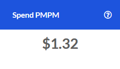
Spend PMPM
The Professional service category Spend PMPM for the most recent 12 months.
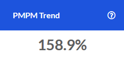
PMPM Trend
The change in PMPM Spend for the Professional service category when compared to the same time one year prior.
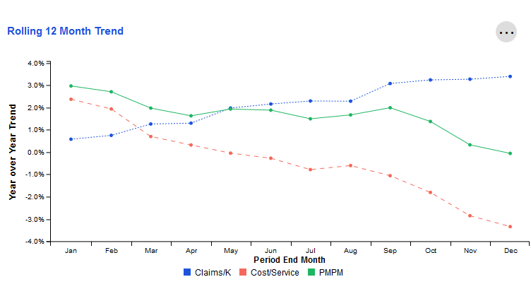
Rolling 12 Month Trend
This tile examines trends for key metrics related to the Professional service category. Each data point represents the end of a 12 month period as compared to the preceding 12 month period. The resulting values indicate whether the overall trajectory of the trend is increasing or decreasing.
The X-axis represents the month that marks the end of this 12-month period. The Y-axis represents the change for that 12-month period compared to the same 12-month period one year prior.
For example, the screenshot below shows 3.0% for PMPM in January. Let's assume the year is 2020. This would mean that during the time period February 2019-January 2020, PMPM increased by 3.0% when compared to February 2018-January 2019.
To view more detail about a specific time period's metrics, simply hover over the data points for that ending month with your cursor.
Professional Components
Key metrics and trends related to Professional service category components over the previous 12 months. Change is measured as a difference when compared to that same 12 month period one year prior.
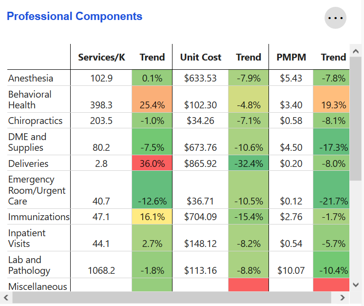
Trend values are color-coded, with the biggest decreases being green and the highest increases being red. Shades of green, yellow, and orange mark the remaining trend values. Trends closer to red are higher and less favorable than those closer to green.
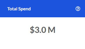
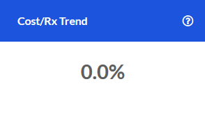
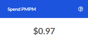
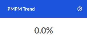
Pharmacy
This page displays key utilization metrics and trends related to the Pharmacy service category.
Total Spend
The total Pharmacy spend over the last 12 months.
Cost/Rx Trend
The change in Cost per Prescription compared to the same period one year prior.
Spend PMPM
The Pharmacy Spend PMPM over the last 12 months.
PMPM Trend
The change in Pharmacy PMPM Spend compared to the same time one year prior.
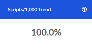
Scripts/1,000 Trend
The change in the number of prescriptions per 1,000 members for the current time period when compared to the same time one year earlier.
Rolling 12 Month Trend
This tile examines Year-over-Year trends for key metrics related to Pharmacy spend and utilization. Each data point represents the end of a 12 month period as compared to the preceding 12 month period. The resulting values indicate whether the overall trajectory of the trend is increasing or decreasing.
The X-axis represents the month that marks the end of this 12-month period. The Y-axis represents the change for that 12-month period compared to the same 12-month period one year prior.
For example, the screenshot below shows approximately 10.0% for PMPM in October. Let's assume the year is 2020. This would mean that during the time period November 2019-October 2020, PMPM increased by 10.0% when compared to November 2018-October 2019.
To view more detail about a specific time period's metrics, simply hover over the data points for that ending month with your cursor.
Top 10 Conditions by Spend
The top 10 conditions for the Pharmacy service category, as determined by the PMPM Spend over the most recent 12-month period.
This tile also displays changes in PMPM Spend for these 10 conditions compared to the same time period one year prior. Increases in PMPM Spend are treated as negative trends while decreases are treated as positive trends.
Top 10 Non-Specialty Drugs by Spend
The top 10 non-specialty drugs for the Pharmacy service category, as determined by the PMPM Spend over the most recent 12-month period.
This tile also displays changes in PMPM Spend for these drugs compared to the same time period one year prior. Increases in PMPM Spend are treated as negative trends while decreases are treated as positive trends.
Specialty Pharmacy
This page displays key utilization metrics and trends for the Specialty Pharmacy service category. It can be paired with the Pharmacy page to provide additional context and display the impact of Specialty Pharmacy claims on the Pharmacy service category overall.
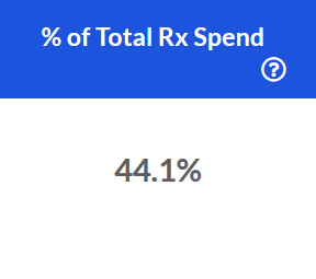
% of Total Rx Spend
The % of Total Pharmacy Spend over the last 12 months that can be attributed to the Specialty Pharmacy category.
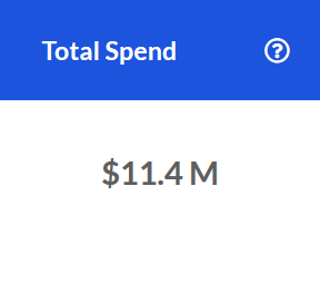
Total Spend
The total Specialty Pharmacy spend for the last 12 months.
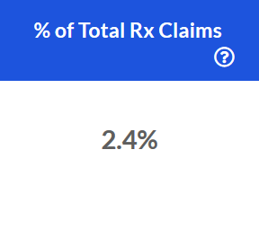
% of Total Rx Claims
The percent of Pharmacy claims that came from the Specialty Pharmacy service category over the most recent 12 months.
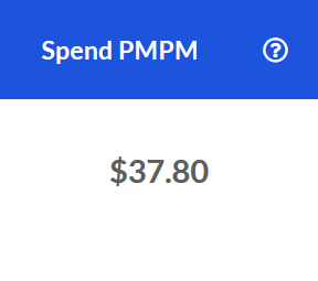
Spend PMPM
The Specialty Pharmacy spend PMPM over the last 12 months.
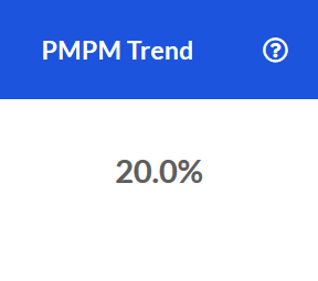
PMPM Trend
The PMPM spend trend for the Specialty Pharmacy service category over the last 12 months.
Distinct Utilizers
The number of distinct Specialty Pharmacy utilizers for the last 12 months. Always less than the total number of members in a population since not all members have Specialty Pharmacy claims associated with them.

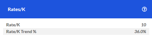
Rates/K
The number of Specialty Pharmacy prescriptions per 1,000 members during the last 12 months.
This tile also displays the change in Rates/K compared to the same 12-month period one year prior.
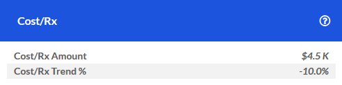
Cost/Rx
The average cost per Specialty Pharmacy prescription over the last 12 months.
The trend shown is the change in Cost/Rx when compared to the same time period one year prior. For example, the trend for October 2020 is the change from September 2018-October 2019 to September 2019-October 2020.
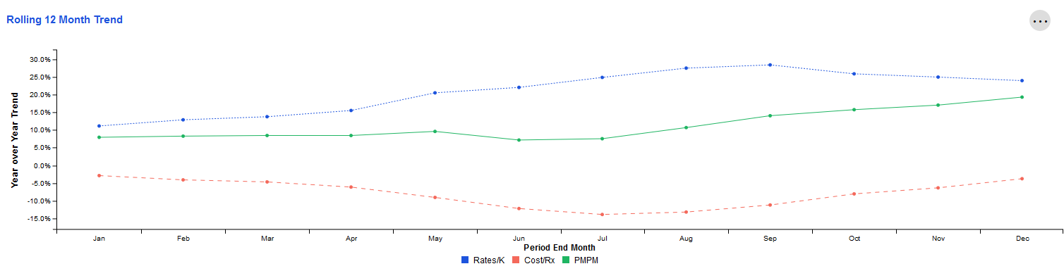
Rolling 12 Month Trend
This tile examines year-over-year trends for key metrics related to Specialty Pharmacy spend and utilization. Each data point represents the end of a 12 month period as compared to the preceding 12 month period. The resulting values indicate whether the overall trajectory of the trend is increasing or decreasing.
The X-axis represents the month that marks the end of this 12-month period. The Y-axis represents the change for that 12-month period compared to the same 12-month period one year prior.
For example, the screenshot below shows approximately 8.0% for PMPM in January. Let's assume the year is 2020. This means that during the time period February 2019-January 2020, PMPM increased by 8.0% when compared to February 2018-January 2019.
To view more detail about a specific time period's metrics, simply hover over the data points for that ending month with your cursor.
Understanding the Collections: Enrollment and Demographics
Population Statistics
This page displays high-level information about a population's makeup, such as the number of members that fall into a particular Relationship Type (e.g. Employee, Spouse).
This data can be viewed alone or paired with other pages, such as those in the Total Cost of Care collection, to provide additional context about how specific demographics may relate to metrics such as utilization rates.
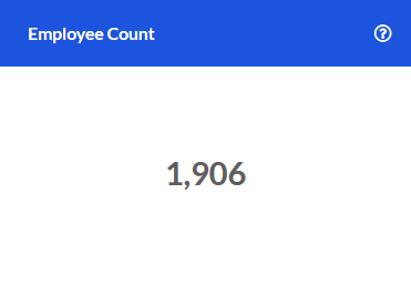
Employee Count
The number of members in the selected population enrolled under "Employee" in the current period. Also referred to as "Subscriber" or "Self".
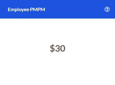
Employee PMPM
The current period PMPM Spend for members who are "Employees".
Spouse Count
The number of members in the selected population enrolled under "Spouse" during the current period.

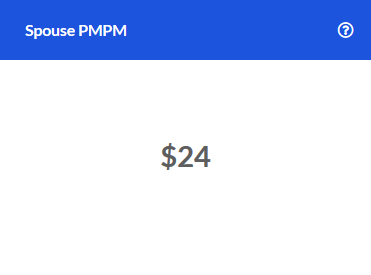
Spouse PMPM
The current period PMPM Spend for members enrolled as "Spouse".
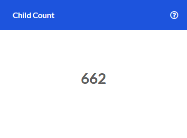
Child Count
The number of members in the selected population enrolled under "Child" for the current period.
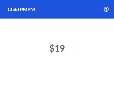
Child PMPM
The current period PMPM Spend for members enrolled as "Child".
Contract Type Trends
The change in metrics for specific contract types in the current period compared to the same time one year earlier. Potential values for contract types include "Subscriber", "Subscriber + Child", and "Subscriber + Family".
The Y-axis displays the trend for each metric, with the metrics illustrated as bars which are grouped together by contract type. The X-axis shows which contract type the metrics are related to.
Note that this tile depicts the trend as of the current period only. For instance, if the current reporting month was January 2020, then a 15.0% trend for Subscriber Claim Counts means that during the time period February 2019-January 2020, Subscriber Claim Counts increased by 15.0% when compared to February 2018-January 2019.

Understanding the Collections: Financial Insights
High Cost Claimants
This page helps users understand drivers of their financial risk and performance by sorting members based upon industry-standard thresholds for individual claimant spend.
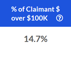
% of Claimant $ over $100k
The percent of total claimant spend over $100,000 for the last 12 months.
For example, let's assume that a claimant had $150,000 in spend over the last 12 months. This metric would take that extraneous $50,000 and divide it by the total spend for the overall population during that same 12 month period. Assuming that total spend was $2M, this would equate to $50,000 divided by $2M.
This comes out to 2.5%. If this claimant was the only member with spend of more than $100,000 for that period, then the $ of Claimant Spend Over $100K was 2.5%.
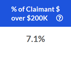
% of Claimant $ over $200k
The percent of total claimant spend over $200,000 for the last 12 months.
For example, let's assume that a claimant had $250,000 in spend over the last 12 months. This metric would take that extraneous $50,000 and divide it by the total spend for the overall population during that same 12 month period. Assuming that total spend was $2M, this would equate to $50,000 divided by $2M.
This comes out to 2.5%. If this claimant was the only member with spend of more than $200,000 for that period, then the $ of Claimant Spend Over $200K was 2.5%.
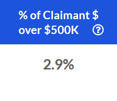
% of Claimant $ over $500k
The percent of total claimant spend over $500,000 for the last 12 months.
For example, let's assume that a claimant had $550,000 in spend over the last 12 months. This metric would take that extraneous $50,000 and divide it by the total spend for the overall population during that same 12 month period. Assuming that total spend was $2M, this would equate to $50,000 divided by $2M.
This comes out to 2.5%. If this claimant was the only member with spend of more than $500,000 for that period, then the $ of Claimant Spend Over $500K was 2.5%.
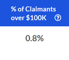
% of Claimants over $100k
The % of individual claimants who generated over $100,000 in spend for the last 12 months. This is a member-focused metric, while the % of Claimant $ metric detailed above is a dollar-focused metric.
In the screenshot below, 0.8% of all claimants generated over $100,000 in spend during the previous 12 months.
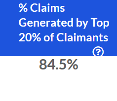
% Claims Generated by Top 20% of Claimants
The percent of total claims attributable to the top 20% of claimants by spend, based upon spend for the last 12 months.
In the screenshot below, we can see that the top 20% of claimants (based on total spend) accounted for 84.5% of claims dollars during the previous 12 months.
% Claims Generated by Top 20% of Claimants
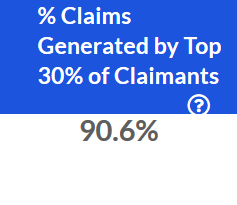
The percent of total claims attributable to the top 30% of claimants, based upon spend for the last 12 months.
In the example below, we can see that over the previous 12 months, the top 30% of claimants by spend generated 90.6% of total claims. In other words, the overwhelming majority of claims during this period came from this subset of claimants.
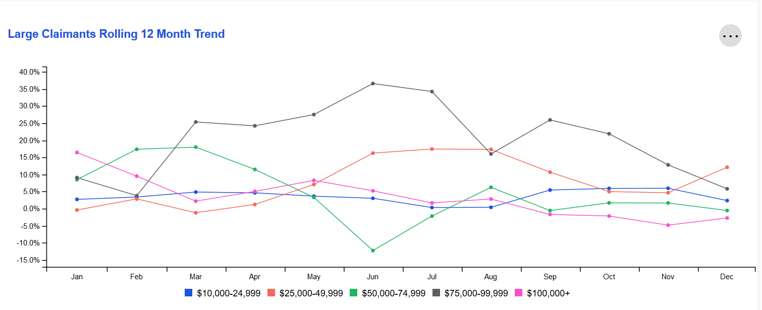
Rolling 12 Month Trend
The change in the number of higher dollar claimants with different claim sizes by month.
The X-axis represents the 12-month period ending on that month. The Y-axis represents the change in that 12-month period compared to the same 12-month period one year prior. For example, September on the X-axis might represent the time period "October 2019-September 2020" while 5.0% on the Y-axis represents a 5.0% change for October 2019-September 2020 when compared to October 2018-September 2019.
To see a specific month's metrics, simply hover over that month's data points with your cursor. To single out a specific threshold(s), simply click on the legend below the chart to hide thresholds until you have narrowed it down to your desired view.
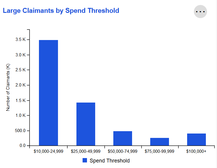
Large Claimants by Spend Threshold
Individual claimants sorted by the amount spent on claims for that member during the last 12 months. Amounts are bucketed into categories, with thresholds based on industry standards for individual claimant spend.
Claimants can be viewed based on either Paid or Allowed Amount by leveraging the Amount Type selection in the Global Filters widget.
Large Claims
This page helps users understand drivers of their financial risk and performance at the claim level by sorting individual claims based on industry-standard thresholds.
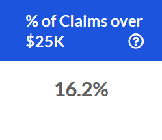
% of Claims over $25k
The percent of individual claims across all service categories that were greater than $25,000 for the previous 12 months.
In the screenshot below, we can see that 16.2% of all individual claims generated by our population during the last 12 months had a total spend over $25,000.
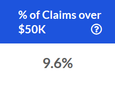
% of Claims over $50k
The percent of individual claims across all service categories that were greater than $50,000 for the previous 12 months.
In the example below, we can see that 9.6% of all individual claims generated by our population during the last 12 months had a total spend over $50,000.
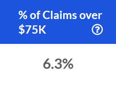
% of Claims over $75k
The percent of individual claims across all service categories that were greater than $75,000 for the previous 12 months.
In the below screenshot, 6.3% of all individual claims generated by our population during the last 12 months had a total spend over $75,000.
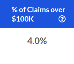
% of Claims over $100k
The percent of individual claims across all service categories that were greater than $100,000 for the previous 12 months.
For example, in the below screenshot, 4.0% of all individual claims generated by our population during the last 12 months had a total spend over $100,000.
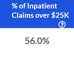
% of Inpatient Claims over $25k
The percent of individual claims in the Inpatient service category that were greater than $25,000 for the previous 12 months.
Below, we can see that 56% of inpatient claims incurred during the last 12 months had a total spend of more than $25,000.
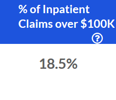
% of Inpatient Claims over $100k
The percent of individual claims in the Inpatient service category that were greater than $100,000 for the previous 12 months.
In the example below, 18.5% of inpatient claims generated over the last 12 months had a total spend greater than $100,000.
Large Claims Rolling 12 Month Trend
This tile examines year-over-year trends for specific spend thresholds. Each data point represents the end of a 12 month period as compared to the preceding 12 month period. The resulting values indicate whether the overall trajectory of the trend is increasing or decreasing.
The X-axis represents the month that marks the end of this 12-month period. The Y-axis represents the change for that 12-month period compared to the same 12-month period one year prior.
For example, the screenshot below shows 88.9% for the \$75,000-99,999 category in January. Let's assume the year is 2020. This would mean that during the time period February 2019-January 2020, the number of claims falling into the \$75,000-99,999 category increased by 88.9% when compared to February 2018-January 2019.
To view more detail about a specific time period's metrics, simply hover over the data points for that ending month with your cursor. For example, hovering over January will reveal the change for each threshold for February 2019-January 2020 when compared to February 2018-January 2019.
To single out a specific threshold(s), simply click on the legend below the chart to hide thresholds until you have narrowed it down to your desired view.

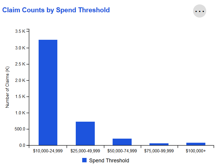
Claim Counts by Spend Threshold
Individual claims over the last 12 months sorted by total spend. Amounts are bucketed into categories, with thresholds based on industry standards for individual claim spend.
Claims can be viewed based on either Paid or Allowed Amount by leveraging the Amount Type selection in the Global Filters widget.
Financial Summary
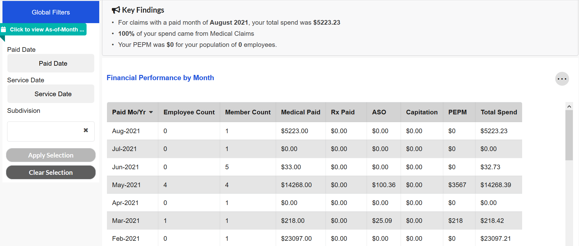
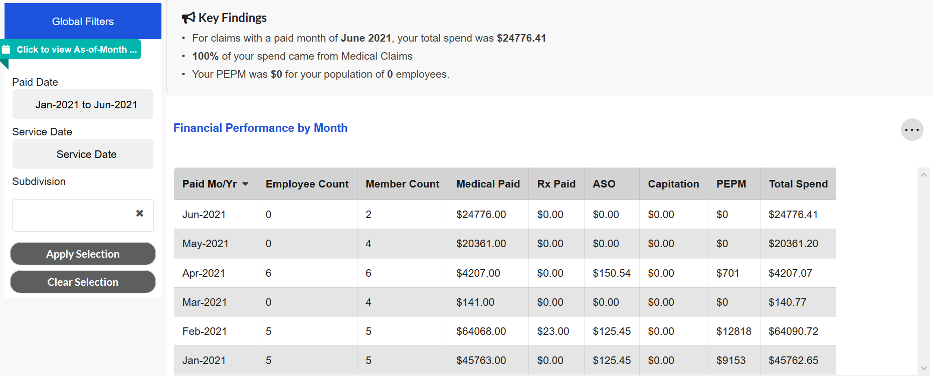
This page provides a monthly overview of the financial performance for a population during a given time period.
Financial Performance by Month
This tile displays key financial metrics on a monthly basis. For example, if the Paid Month/Year for that row of data is August 2020, then the metrics shown are based on claims paid during August 2020.
Users can select a different Paid Date and Service Date by using the Global Filters. If a Paid Date selection is made for January 2021-June 2021, then the tile will only display data for those six Paid Month/Year combinations. This scenario is illustrated in the below screenshots. The first image displays the pre-filtered view while the second image displays the view after the Paid Date filter has been applied.
If no Paid Date or Service Date selections are made, then the tile will display all of the Paid Month/Year combinations for which data is available for a maximum of 36 months.
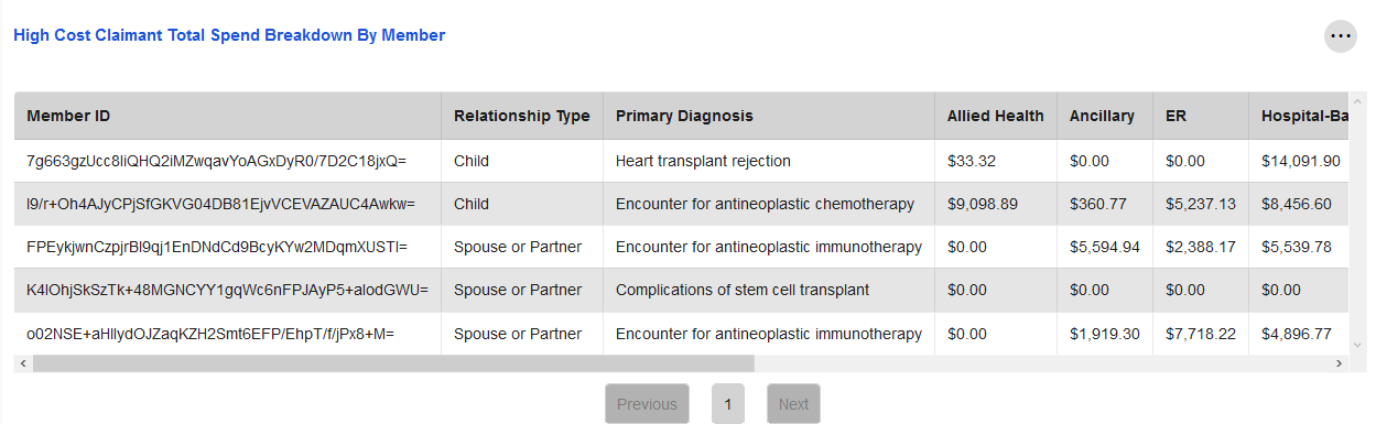
HC Claimants (Monthly)
This page displays a breakdown of high cost claimant spend for a given Paid Date and/or Service Date period. It can be used alongside the High Cost Claimants page in order to pair this monthly breakdown with the 12-month trends and overview provided in High Cost Claimants.
High Cost Claimant Total Spend Breakdown by Member
This tile illustrates the spend per member for those claimants who are determined to be high cost. Claimants are considered high cost if they have accrued $1M or more in spend over the last 36 months.
Spend is broken out by service category, including Inpatient, Outpatient, Specialist, and Pharmacy, in addition to being displayed as a sum for that member. These categories can be viewed by using the scroll bar located at the bottom of the tile.
Similar to the Financial Summary page, users can select various Paid Date and/or Service Date combinations in order to limit the periods for which data is displayed. If no options are selected, then the tile will display total spend for these high cost claimants across all months for which data is available, up to 36 months.
This tile also displays the primary diagnosis associated with each high cost claimant, based on the claims data provided. The primary diagnosis with the most spend across all high cost claimants during the selected time period is noted in the Key Findings at the top of the page.
The Relationship Type column functions similarly to the Relationship Type Global Filter included on several other pages, such as High Cost Claimants.
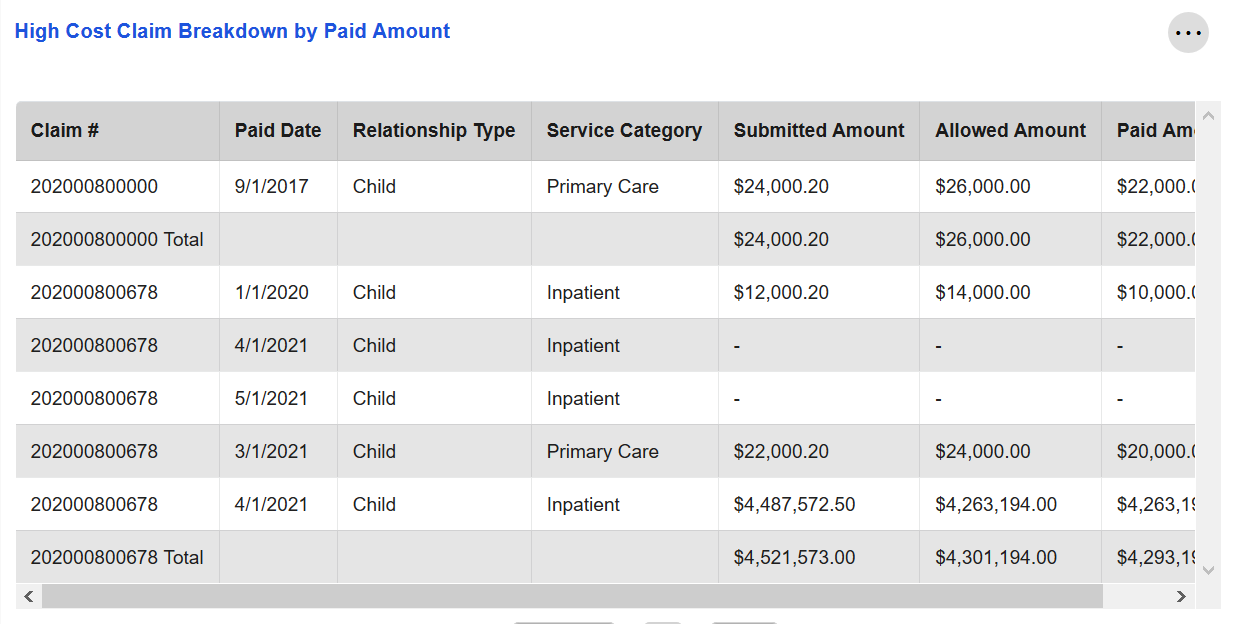
Large Claims (Monthly)
This page provides a look at a population's large claim spend for a given Paid Date and/or Service Date period. It can be paired with the Large Claims page, which focuses on trends over the last 12 months.
High Cost Claim Breakdown by Paid Amount
This tile shows the spend for claims that are considered "large claims." Claims meet this threshold if they occurred in the last 36 months and had $250,000 or more in spend.
Along with the submitted, paid, and allowed amounts for each claim, this tile also displays the service category associated with that claim. If a claim fell into more than one service category, then one row will be displayed in this tile per service category. A total row is also shown that has the aggregate spend for that claim across all service categories.
Similar to the Financial Summary and HC Claimants (Monthly) pages, users can select various Paid Date and/or Service Date combinations in order to limit the periods for which data is displayed. If no filters are applied, then the tile will display large claims across all months for which data is available, up to 36 months.
The Relationship Type column functions similarly to the Relationship Type Global Filter included on several other pages, such as Large Claims.
Understanding the Collections: Opportunity
Clinical Measures
This page combines claims-based financial and clinical data, cScore, and clinical quality measures to highlight areas of improvement for population management that can lead to financial savings.
Clinical Measure Opportunities
This chart highlights key opportunity areas by showing the aggregate potential financial opportunity associated with the closure of specific clinical measures.
Some of these measures are preventative (e.g. Annual Well Visits), while others are for the active management of chronic conditions (e.g. Insulin compliance among diabetics).
The total net financial opportunity for individual clinical measures has been rolled up to their associated disease/condition (e.g. Insulin compliance and HbA1c testing to Diabetes).
Net savings is the gross savings estimate adjusted for the cost of closing clinical measures. Total Opportunity is the total net savings potential associated with 100% closure of clinical measures.
Expected Savings is the expected net savings based on the probability that members will be willing to change their behavior from non-compliant to compliant (i.e. not all members are willing to change their behavior, so expected opportunity is always less than total potential opportunity).
Expected savings assumes 100% of members with open clinical measures are targeted through a care management program.
A dropdown menu can be used to select between "Total Opportunity" and "Expected Opportunity." "Total Opportunity" is the default value.

Opportunity Summary
This chart shows the total gross financial savings potential and total expected financial savings potential for the selected health management opportunity for the current and prior periods.
The user may select which measure group to drill down into within the filter. The condition selected within this filter also updates the values in the Clinical Measure Comparison and Clinical Measure Detail tiles.
The filter options align with groups displayed in the Clinical Measure Opportunities tile. By default, a summary including all groups is shown.

Clinical Measure Comparison
This chart shows how specific clinical measures contribute to the total financial opportunity for the measure group selected in the Opportunity Summary tile. If no measure group is selected in that tile, then Clinical Measures Comparison will display data for all groups.
A local filter can be used to select between "Total Opportunity" and "Expected Opportunity." "Total Opportunity" is the default selection.

Each circle represents a clinical measure (e.g. HbA1c testing for diabetics). The size of the circle represents the size of the financial opportunity for closing the clinical measure (i.e. the larger the circle, the greater the opportunity).
The position to the left or right of the center vertical line indicates that the opportunity is higher or lower than it is for peers, respectively, and by how much.
For example, if the circle is at +10% on the x-axis, then the opportunity for the user is 10% lower than the peer group for that specific clinical measure (note that a lower opportunity is an indication that a measure is better managed).
The position to the top or bottom of the center horizontal line compares the financial opportunity for that measure in the selected time period against the prior 12-month period.
A value of -10% on the y-axis means that the financial opportunity for that measure went up by 10% from the previous year.
Axes
X-Axis: Comparison of Me against Peers as of the Selected Period.
Y-Axis: Comparison of Me for the currently selected period vs. Me in the prior period.
Data Points
Each bubble represents the clinical measures that are associated with the condition category selected in the Opportunity Summary Tile.
The relative area of a circle is determined by the total size of the opportunity for the clinical measure based on the local filter selection as of the current selected period (1-12 month look back) for the Me group.
Clinical Measure Details
This visualization shows the risk and financial opportunities associated with closing an individual clinical measure.
The local filter allows users to choose specific clinical measures. The list of measures available are based on the condition category chosen in the Opportunity Summary tile's cross-tile filter.
Based on the selected clinical measure within the local filter, further drilldown is provided for members eligible for that measure. This breakout details the impact of care management efforts focused on closing that measure by examining cost, risk, incidence, and compliance metrics.
Each measure is rated on its difficulty to close (Easy, Medium, or Hard). These ratings are based on a clinical survey of metrics ranging from financial, behavioral, and access to care metrics to industry benchmarks.

The variables listed in this tile are:
| Variable | Definition |
|---|---|
| People Eligible | The number of people per 1,000 eligible for the selected clinical measure in the filter above based on the Global Filter combination. |
| Compliance Rate | The proportion of members eligible and compliant for the selected clinical measure in the filter above based on the Global Filter combination. |
| Avg. Overall Compliance Score | Compliance Score is the proportion of clinical measures that were closed for all eligible measures based on the Global Filter combination. |
| Avg. Cost/Person | The average combined medical and pharmacy costs for those eligible for the selected clinical measure in the filter above based on the Global Filter combination. |
| Avg. Risk Score | The average prospective risk score for those eligible for the selected clinical measure in the filter above based on the Global Filter combination. |
Disease Onset
This page combines claims-based financial and clinical data, cScore, and clinical measures to highlight the populations where effective management would result in the largest return on investment. It also shows the value of effectively managing risks to avoid high cost events at the population and key MSA levels.
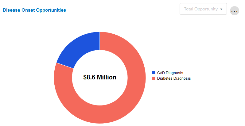
Disease Onset Opportunities
This chart highlights key opportunity areas by showing the aggregate potential financial opportunity associated with better management of the predictable progression of a disease state.
Emerging Disease Onset Opportunity derives from a subset of clinical models that predict a largely non-preventable clinical outcome, namely diagnosis with Diabetes or Coronary Artery Disease (CAD). Underlying this metric is the possibility that knowing a person will develop these conditions does not necessarily allow the prevention of the clinical diagnosis, but instead allows better management of the predictable progression of that person's disease state.
Total Opportunity is the total potential savings associated with 100% closure of clinical measures. Expected Opportunity is the expected net savings based on the probability that members will be willing to change their behavior from non-compliant to compliant. Since not all members are willing to change their behavior, Expected Opportunity will always be less than Total Opportunity.
A local filter will be used to select between "Total Opportunity" and "Expected Opportunity." The default value is "Total Opportunity."
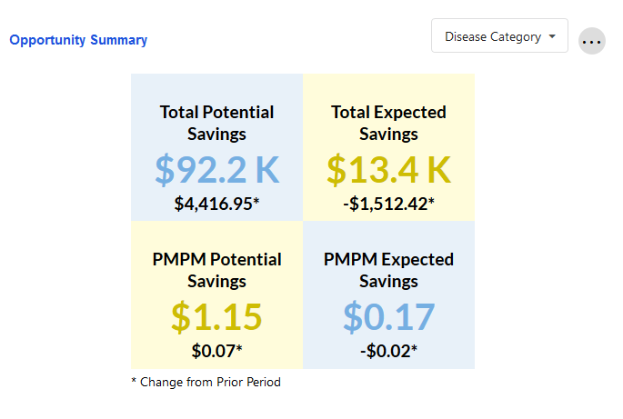
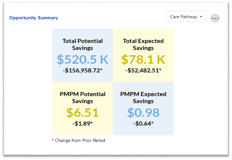
Opportunity Summary
This tile shows the potential and expected savings for a given health management opportunity for the current period, along with change from the prior period.
The user may select which condition to drill down into by using the dropdown menu. This cross-tile filter also updates the values in the PMPM Savings by MSA and Disease Onset Details tiles.
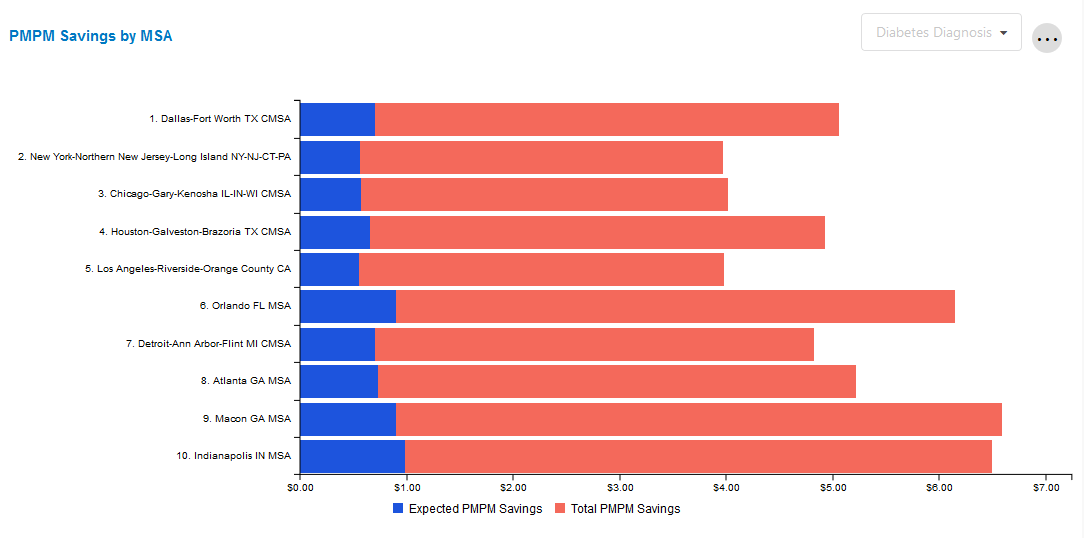
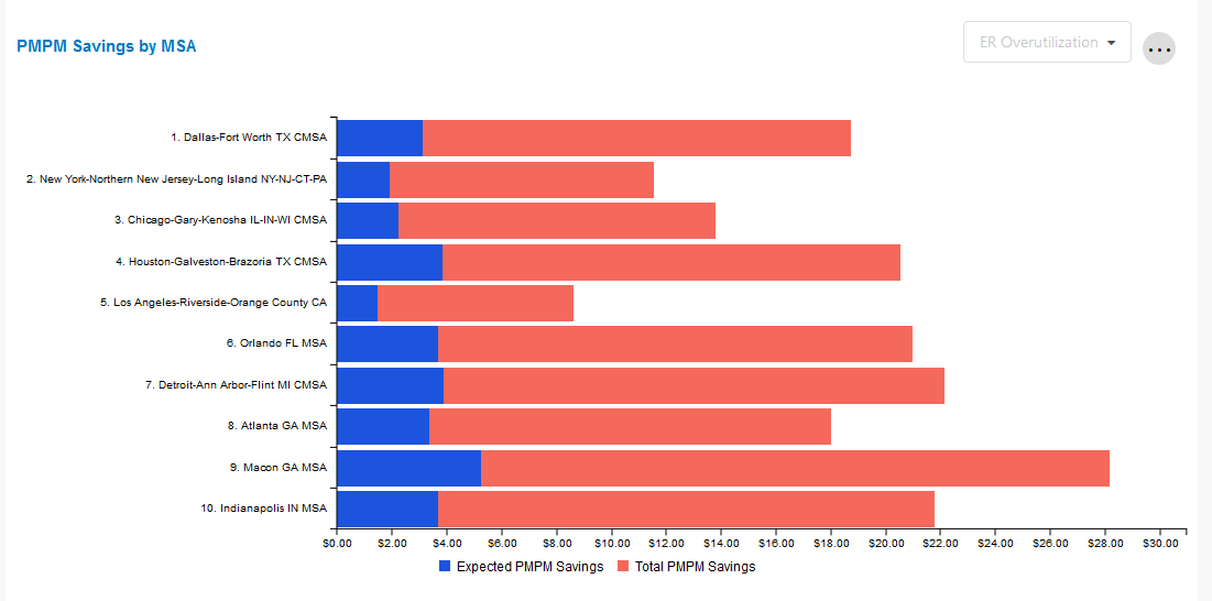
PMPM Savings by MSA
This tile shows the total potential PMPM savings and total expected PMPM savings for the selected health management opportunity for the selected period and top 10 largest MSAs by total population within the client's population.
The user may select which condition to drill down into within the cross-tile filter. Any change between conditions will also update the Opportunity Summary and Disease Onset Details tiles.
Disease Onset Details
This tile illustrates member count, financial risk score, and expected savings on a PMPY basis for the condition chosen in the cross-tile filter. It also sorts members into three "buckets" based on their level of risk for developing the selected condition.

Member Redirection
This page provides users with insights to optimize the design and evaluation of their health management programs.
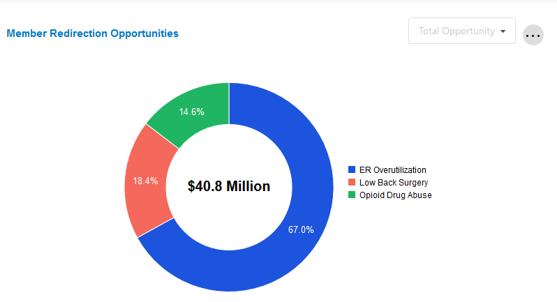
Member Redirection Opportunities
The Member Redirection Opportunity tile derives from a subset of clinical models that predict outcomes that can be managed towards more effective levels of care or treatment modality, such as ER overutilization, lower back surgery, and opioid drug use.
Total Opportunity is the total potential savings associated with 100% closure of clinical measures. Expected Opportunity is the expected net savings based on the probability that members will be willing to change their behavior from non-compliant to compliant (i.e. not all members are willing to change their behavior). This is why expected opportunity is always less than total opportunity.
A local filter can be used to select between "Total Opportunity" and "Expected Opportunity." The default value is "Total Opportunity."
Opportunity Summary
This tile shows the potential and expected savings for a given health management opportunity for the current period, along with change from the prior period.
The user may select which condition to drill down into by using the dropdown menu. This cross-tile filter also updates the values in the PMPM Savings by MSA and Member Redirection Details tiles. The default value is "Care Pathway"; a selection must be made to update the other two tiles.
PMPM Savings by MSA
This tile shows the total potential PMPM savings and total expected PMPM savings for the selected member redirection opportunity for the selected period and top 10 largest MSAs by total population within the client's population.
The tile is automatically populated based on the cross-tile filter selection in the Opportunity Summary tile.
Member Redirection Details
This tile shows the risk and financial opportunities associated with redirecting a member away from a high cost care item.
The tile is automatically populated based on the cross-tile filter selection in the Opportunity Summary tile.

Understanding the Collections: Performance
This section breaks down the Performance Collection pages and tiles, allowing users to understand how the clinical management of their program and other macro trends impact their financial outcomes.
Care Facilitation
This page reports the PMPM savings realized from changes in member outcomes from the baseline measurement period to the current evaluation period across three care areas: Clinical Measures, Disease Onset, and Member Redirection.
Clinical Measure PMPM Savings
This tile shows the total savings achieved through the closure of clinical measures. The thick bar value in the center of the gauge chart is \$0.00, representing savings if there is no change in compliance rate between the baseline and evaluation periods.
Values decrease to the left, meaning a decrease in compliance and a corresponding loss of savings opportunity. Values increase to the right, meaning an increase in compliance and the achievement of financial savings.
The condition category table reports realized savings (or losses) at the condition category level based on the aggregate change in member behavior compliance.

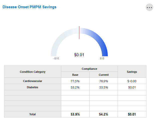
Disease Onset PMPM Savings
This tile shows the total savings achieved through the management of clinical measures associated with a newly diagnosed members with Diabetes and CAD. The thick bar value in the center of the gauge chart is \$0.00, representing savings if there is no change in compliance rate between the baseline and evaluation periods.
Values decrease to the left, meaning a decrease in compliance and a corresponding loss of savings opportunity. Values increase to the right, meaning an increase in compliance and the achievement of financial savings.
The condition category table reports realized savings (or losses) at the disease category level based on the aggregate change in member behavior compliance.
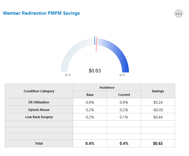
Member Redirection PMPM Savings
This tile shows the total savings achieved through redirecting a member from a high cost service. The thick bar value in the center of the gauge chart is \$0.00, representing savings if there is no change in compliance rate between the baseline and evaluation periods.
Values decrease to the left, meaning a decrease in compliance and a corresponding loss of savings opportunity. Values increase to the right, meaning an increase in compliance and the achievement of financial savings.
The condition category table reports realized savings (or losses) at the disease category level based on the aggregate change in member behavior compliance.
Total Savings PMPM
The savings total shown represents the total savings/loss realized PMPM from the Clinical Measure, Disease Onset, and Member Redirection tiles.

Care Activity
This page provides insight into the design and evaluation of health management programs. It highlights how member outreach has affected outcomes, risk & financial performance by combining claims-based financial and clinical data, outreach and engagement data, cScore predictions, and clinical measures.
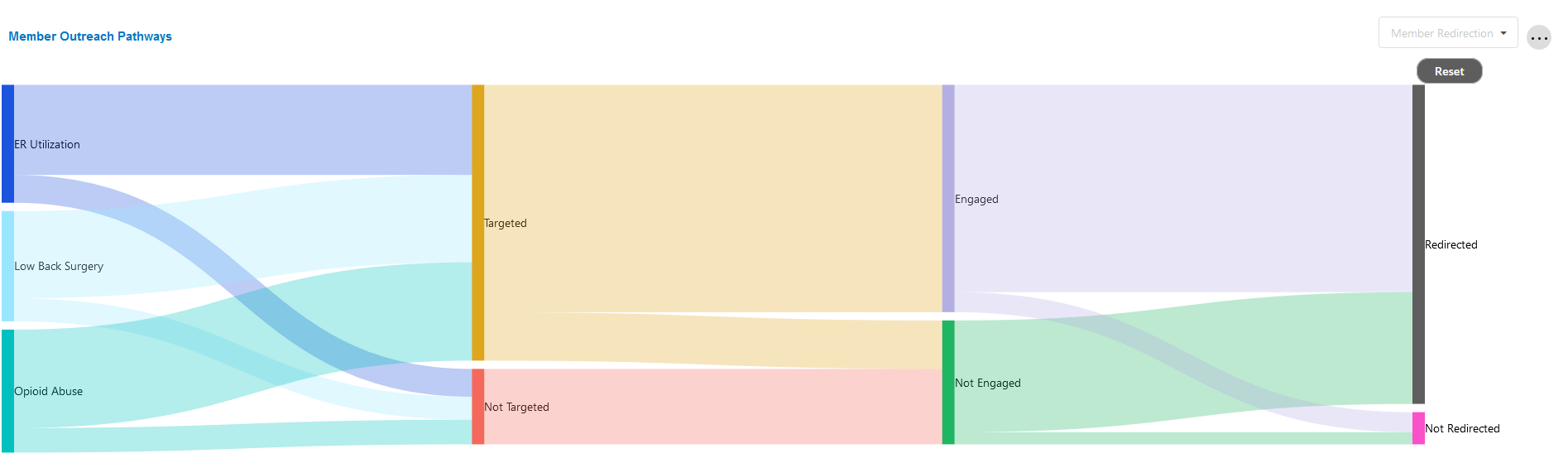
Member Outreach Pathways
This chart shows the impact of outreach on engagement and favorable outcomes. For example, it shows the impact of targeting a member, engaging the member, and how that can affect the closure of a measure.
In the case of the Clinical Measure and Disease Onset categories, the Sankey chart visualizes the flow of a member's eligible measures through targeting, engagement and then outcome (measure closed or open). In the case of the Member Redirection category, the Sankey chart visualizes the flow of a member's behavior through targeting, engagement and then outcome (redirection or not).
The user is able to update the category by making a selection in the drop down on the top right. The user can click on sections of the Sankey to drill down into that particular area. A reset button is available in order to return to the default view.
To quickly see the number of members who fit certain criteria (e.g. Targeted-Engaged), simply hover over the relevant area of the chart.
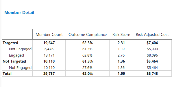
Member Detail
This tile shows the count, outcome compliance, risk score, and risk adjusted PMPM cost for the total eligible, not targeted, and targeted splits. This provides the user an understanding of the impact of outreach on compliance and cost for a selected condition.
This tile updates based on the selections made in Member Outreach Pathways. If no selections are made, it will default to summary values.
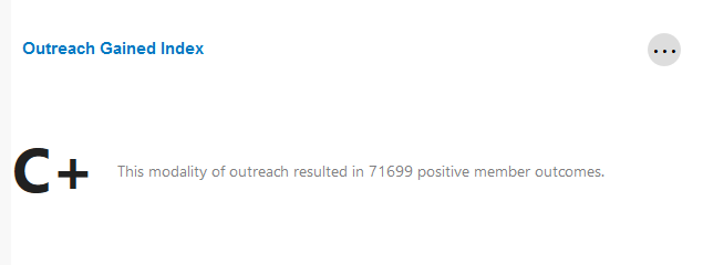
Outreach Gained Index
This tile displays the marginal impact of targeting and outreach on closure of clinical measures when compared to measure closure without outreach. It provides a grade (A through C) based on the effectiveness of outreach based on the cross-tile filter selection in Member Outreach Pathways. If no selections are made, or if data for a given selection is not available, this tile will remain empty.
Trend Reconciliation
This page highlights the various factors that contribute to changes in service category utilization and spend. It may be used alongside the service category-specific pages within the Total Cost of Care collection to provide an overview of utilization and cost trends.
Overview
This is the first sub-page within the Trend Reconciliation page.
Trend Drivers Summary
This tile shows the change in PMPM from prior period to current. It also highlights the factors contributing to change in trend, and the change in trend values made by care facilitation efforts.
The tile should be read from left to right, beginning with the Start Date. This is the month-year combination equivalent to one year prior to the current reporting period. For example, if the current reporting period is January 1, 2020, then the Start Date will be January 2019.
The next five (5) columns represent various trend drivers. The bars represent the relative size of each bar, while the dollar value shown above the bar is the total financial impact of that driver and the percentage below is the change in that driver compared to the last period. A further breakdown of these drivers is available in the Trend Drivers Detail & Global Trend Drivers and Care Facilitation Detail tiles.
The last value is the End Date, which is the latest month-year combination for which data is available. For instance, if the current reporting period is January 1, 2020, then there is data through December 31, 2019. In this case, the End Date will be December 2020.
The "Trend Without Care Facilitation" value shown at the top of the chart represents what the overall trend would have been if no care facilitation efforts had occurred. "Trend" displays the actual change between the Start and End Dates.

Paid Trend Development
This tile highlights the differences between the Prior Period Paid PMPM and Prior Period Allowed PMPM, as well as the Current Period Paid PMPM.

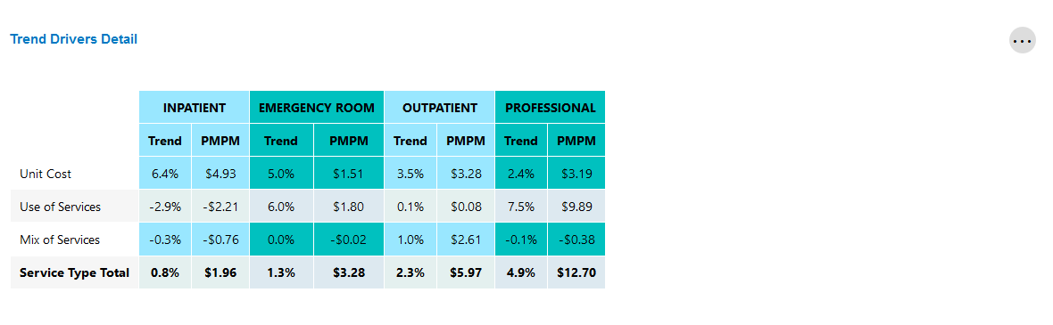
Trend Drivers Detail
This tile reports the percent change between the current and prior periods (i.e. "trend") and current PMPM for the categories listed.
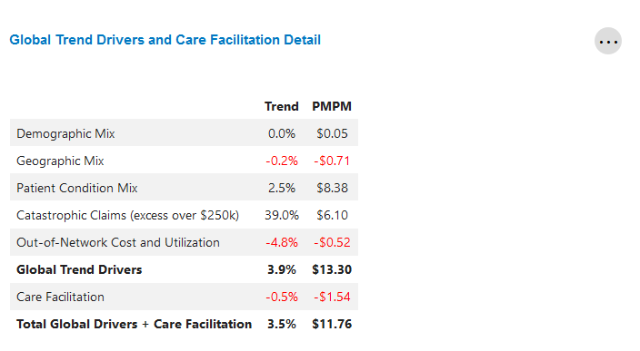
Global Trend Drivers and Care Facilitation Detail
This table highlights the global factors that contributed to financial performance in the current reporting period.
It also displays the total savings (or loss) that was realized through care facilitation programs.
Component Drilldown
This is the second sub-page within the Trend Reconciliation page.
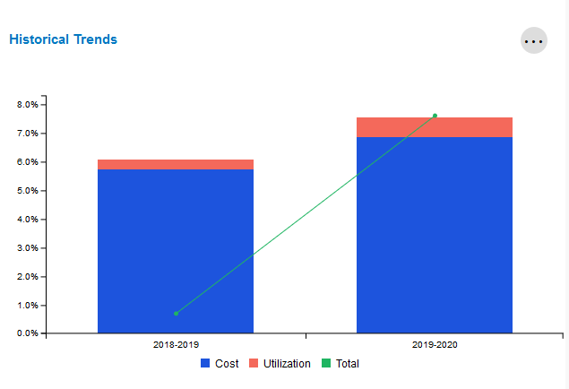
Historical Trends
This tile compares the current period's trend against the prior period's trend, broken out by cost and utilization.
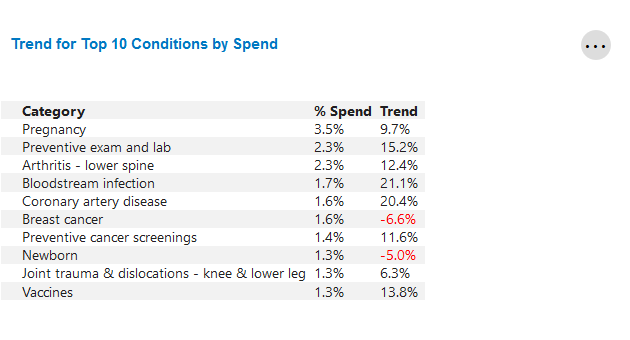
Trend for Top 10 Conditions by Spend
This tile identifies the top 10 condition categories with the highest PMPM spend for the most recent 12 months.
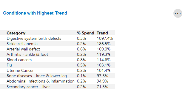
Conditions with Highest Trend
This table identifies the top 10 condition categories with the highest change in trend from the previous year.